The city of Cologne will remove the iconic Cologne cathedral tower from its logo, and use a new logo in the future for the letterhead and on work clothes, but a large outcry has erupted due to the decision.
“My 92-year-old mother is stunned, my 11-year-old godchild is crying and my friend in London does not understand it,” writes the sculptor and painter Cornel Wachter, for example.
The president of the German-Hungarian Society, Gerhard Papke, also commented on the project on Twitter: “The decision in Cologne to remove the cathedral from the city’s logo should not come as a surprise, since mosques were recently expressly allowed to call the muezzin.” Papke was referring to Cologne’s controversial decision last year to allow the “call to prayer” in the city.
[pp id=19659]
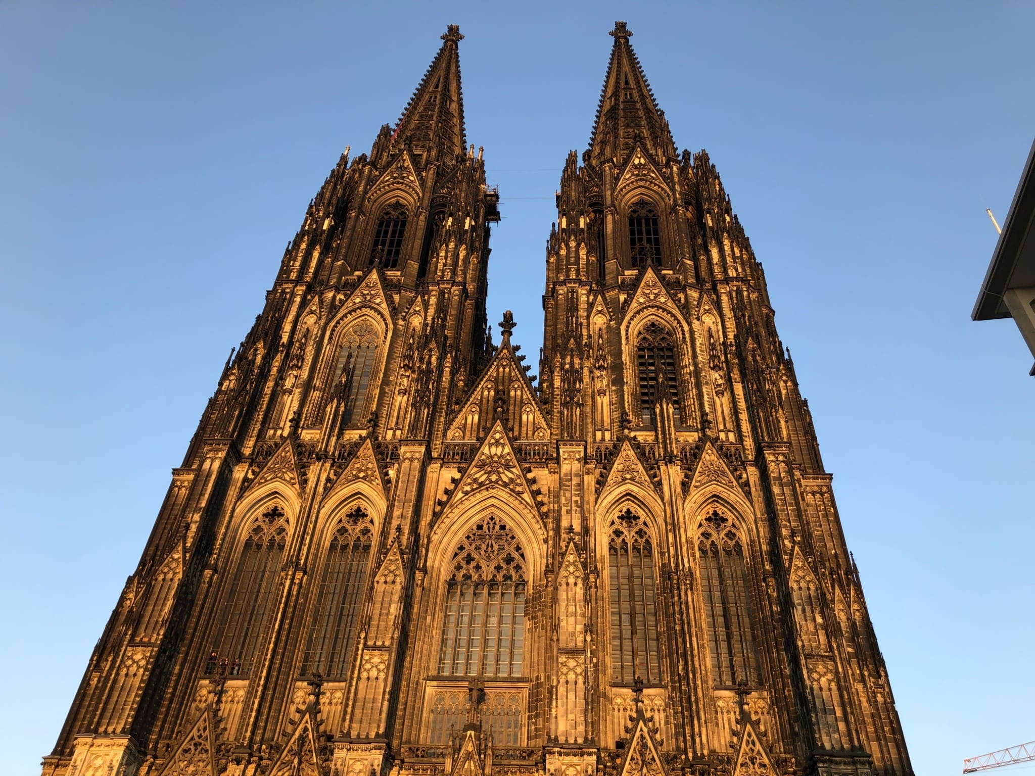
The renowned monument is a World Heritage Site, the largest Gothic cathedral in Northern Europe, has the largest facade of any cathedral in the world, and is the most visited landmark in Germany. As a result, not only Christians have a special place in their heart for the cathedral, but also people who simply appreciate the culture and architecture of the city, with the twin spires of the cathedral having dominated the city skyline for centuries.
Politicians from various parties have decried the decision, including Alternative for Germany’s Beatrix von Storch, the deputy parliamentary leader of the party, who wrote on Twitter, “The mayor removes the Cologne Cathedral from the city logo because it is ‘old-fashioned.’ Nobody conquers our country. It is we ourselves who voluntarily erase our culture. We create a vacuum that others are happy to fill.”
Although the city paid €10,000 to a design firm to change the logo, the cost of adding a new logo to letterhead, city buildings, city vehicles, and in other areas will likely cost tens of thousands of euros, if not more.
The city administration justified the redesign of the logo after commissioning a market analysis. According to the German newspaper Kölner Stadt-Anzeiger, the interviewees found the previous logo with the church to be “old-fashioned, bulky and emotionless.”
According to the city administration, the previous design “does not do justice to the character of a livable, highly attractive metropolis in comparison to other European metropolises.” In addition, it does not stand for the “increasing service character of the city’s self-image of the administration.”